
UI requests for FrameMaker
SPOILER ALERT: I’m planning on an update to my Working with Content Fm reference book soon, and would love to get these UI elements tightened up in time for that next version.
-Matt
While teaching a structured authoring class recently, I noted a few things that would improve the FrameMaker authoring experience. I’ve grouped into standard (unstructured, paragraph-based) items, followed by items specific to structured authoring. If you agree with my suggestions, please click on the appropriate links to vote on these suggestions via Adobe’s support portal. Votes make a huge difference, so please vote where appropriate!
Unstructured UI Suggestions
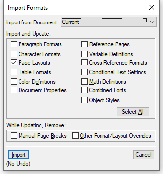
Relabel Page Layouts to Master Pages
When using File > Import > Formats, the option to import Master Pages is (and has long been) labeled Page Layouts. Please change to Master Pages.
https://tracker.adobe.com/#/view/FRMAKER-8626
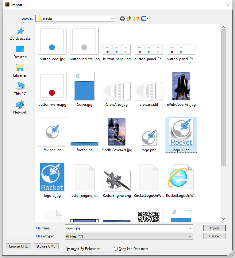
Move Import by Reference to top of Import dialog
The more recent option to Insert > Image has removed the option to copy into document, but the older File > Import > File method still exists. Since it’s still there, as with previous versions, the option to Import By Reference or Copy Into Document is placed (illogically) at the bottom of the dialog. Please move to the top of the dialog to promote a user choice that facilitates proper functionality.
https://tracker.adobe.com/#/view/FRMAKER-8627
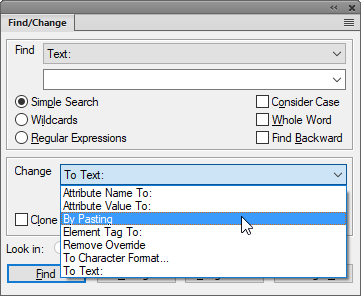
Relabel ‘By Pasting’ to By Pasting Clipboard Content
In the Find/Change dialog, the Change: By Pasting option performs the function of pasting the current content of the clipboard.
Please improve this label to By Pasting Clipboard Content (or similar) to promote the discoverability of this popular and useful feature.
https://tracker.adobe.com/#/view/FRMAKER-8628
Relabel Extra Spaces to Exactly Two Spaces
In the Spelling Checker (ugh, see next entry…) there is an option labeled Extra Spaces. However, this feature only flags exactly two spaces as a spelling mistake. Either relabel the feature to Exactly 2 spaces (easy) or configure it to actually flag two or more consecutive spaces as a spelling mistake.
https://tracker.adobe.com/#/view/FRMAKER-8629
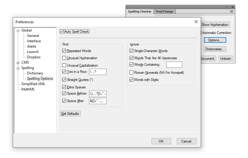
Even better, relabel the existing feature to Exactly 2 spaces, and provide an additional option to flag 3 or more spaces so they can be replaced with a tab. Perhaps we could label it 3 or more consecutive spaces.
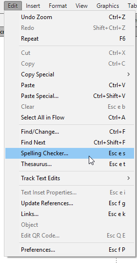
Relabel ‘Spelling Checker’ to ‘Check Spelling’
Spelling Checker doesn’t match with all other spellcheck options in the Adobe product line. Please align with the other products.
https://tracker.adobe.com/#/view/FRMAKER-8630
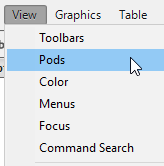
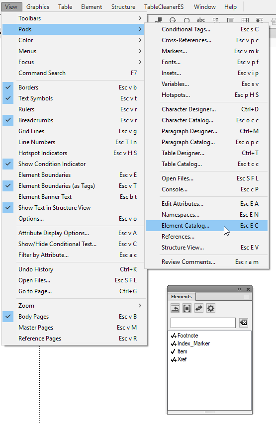
Refer to Pods as Panels
[I’ve been promised a fix in an upcoming release!!!]
The eternal battle for UI label supremacy…perhaps this is already decided, but Pods sounds old. Palettes sounds dated and ambiguous. See this for “official” stance:
https://help.adobe.com/en_US/framemaker/2015/using/using-framemaker-2015/frm_basics_ba/Pods-.htm
Can we just call them Panels and be done with it? If I’m not mistaken, this also aligns with Adobe flagship UI conventions.
https://tracker.adobe.com/#/view/FRMAKER-8631
Structured UI suggestions
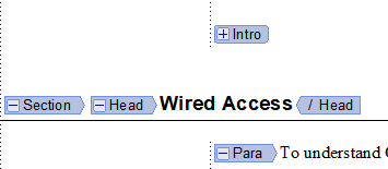
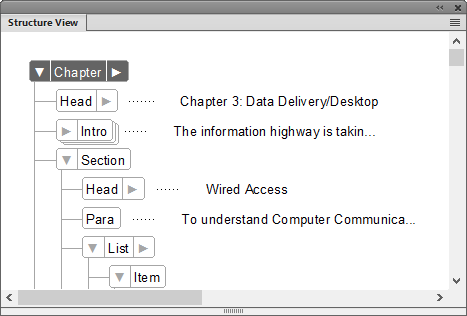
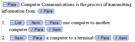
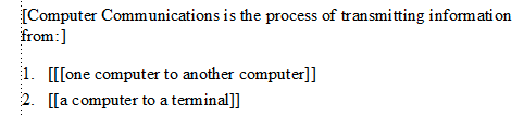
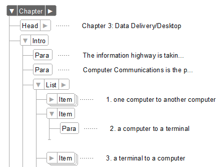
Match Document View tags and Structure View tags
Make sure the View > Element Boundaries as Tags icons to expand/collapse structure match with the graphics in the Structure View.
https://tracker.adobe.com/#/view/FRMAKER-8632
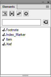
Label ‘Elements’ panel to match menu item
The View > Pods > Element Catalog option brings up the Elements panel. Please align the labels.
https://tracker.adobe.com/#/view/FRMAKER-8634
Change Element Catalog icons to text
Speaking of the Element Catalog, with all the extra room atop the panel, please replace the unintuitive icons with text labels, as we did in the Paragraph and Character Designers
https://tracker.adobe.com/#/view/FRMAKER-8635
Display Element Boundaries in color
Please match the color of the boundary brackets to the color of the Boundaries as Tags items.
https://tracker.adobe.com/#/view/FRMAKER-8636
Use consistent space in displaying Structure View snippet
The snippet is currently spaced from the edge of the related element bubble. Please align snippets to the same position so they don’t jump around as you expand/collapse parts of the structure view.
https://tracker.adobe.com/#/view/FRMAKER-8637
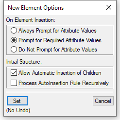
Change ‘Allow Automatic Insertion of Children’ to ‘Automatically Insert Child Element’
No matter how long I’ve seen it, it always sounds vaguely creepy and stalkerish. Please change this label to ‘Automatically Insert Child Element’ or similar.
https://tracker.adobe.com/#/view/FRMAKER-8638
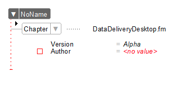
Relabel ‘NoName’ as ‘Undefined’
When working with elements that are undeclared in the EDD, content is displayed as ‘NoName’. Please change this to ‘Undefined’ or ‘Unknown’.
https://tracker.adobe.com/#/view/FRMAKER-8639

Join over 4,300 of your peers and get my latest content sent to you for free, along with some of my all-time favorites.