Review: FrameMaker (2017 Release)
The new release of FrameMaker is here! And since FrameMaker is such a big part of what I do, I’m pleased to announce that I’m very happy with this latest release. While I have yet to see a “perfect” release of any application, from Adobe or anyone else, this version gets a big stamp of approval from me.
The thing that’s most exciting is the improvements to the user interface (UI) and the user experience (UX). I got a great chance to put the features through their paces, as Adobe was kind enough to not only have me on the beta team for this release, but to commission a series of videos covering the latest features. I quickly warmed up to the changes in the designers and the catalogs, and was quite impressed with the conditional text and cross-reference pods.
New features are always fun, and the Project Manager, Command Search, and Insert Images workflows are all excellent improvements to the application. As I mentioned above, there are things I’d like done differently, but I absolutely look forward to a faster, more efficient workflow using the myriad of subtle changes in this version. In fact, I may enjoy them even more, because I’ll recognize the ways that they’re different from before. If you’re curious about the minutia, I’ve included a comprehensive list of changes from Adobe at the end of this post and bolded my favorite features.
 There are so many subtle changes to Fm 2017 that there’s no way I can discuss them all here. However, here are a few of the bigger changes to FrameMaker, along with some suggestions I think would further enhance the new functionality.
Straight off, here’s my biggest gripe about this release: Nearly every icon, pod (I still want to call ’em panels), dialog, and function has either been enhanced, redesigned, or moved. And just like when Acrobat X changed it all up, it’s going to take some getting used to. I don’t know if the UI overhaul is quite as drastic as in the FrameMaker 9 release, but it’s substantial.
What I like: New users have a more intuitive, more discoverable product.
What I’ll like over time: Getting used to the new locations and the new layout will try your patience for a while. The Special menu has correctly been eliminated, and other behaviors like cross-references and image insertion behave in substantially different ways. Better, but different! I do applaud the team for putting stuff “where it belongs” even though some of these things date back to before FrameMaker was acquired by Adobe.
The gripe: Because I have my FrameMaker reference book to update, it means I’ll be able to use even less of the existing text than usual, and need to recreate nearly every screenshot used in the book. And, because I teach folks on multiple versions, I now have more stuff I need to keep in my head. But this isn’t the first, nor the last time I have to deal with improvements to UI!
Changes to the UX drives changes to the UI
Menu structure and command search
 Most notably, the oddly named, and 20 year old Special menu is gone! The items previously listed there have moved to more logical places, including the new Insert menu item. Other menu items have shifted, but another big enhancement is the command search function in the upper right corner of the screen. Just type in a keyword and you’ll get a list of available commands, and their shortcuts.
What I like: Command Search is a keyword search, so you don’t have to match exactly with your phrase.
What I want to like more: Where more than one shortcut exists, not all the available shortcuts are listed.
Potential for improvement: Since I use this command when I can’t find a particular function, I’d really appreciate seeing the navigation path in the command search results where appropriate.
Improved image insertion
The most prominent new feature in the Insert menu is the new Insert > Image command. This new workflow brings the command to a second level menu item (instead of the previous third level File > Import > File command, which still exists) and also speeds image insertion by importing at 100% where width permits, but scales to fit when there’s not enough room. There are also improvements to the Object Properties pod.
More UX improvements
Adobe has tightened up the overall user experience with support for larger displays (all the way to the 4k standard of 3,840 x 2,160 pixels), and with improvements to existing controls. Previous “pod sets” like those controlling conditional text have been rethought, and many of the second level pods have been (thankfully!) turned into modal dialogs, appearing when needed, but then getting dismissed when not in use. This greatly reduces pod clutter while authoring. Dialogs now open into the center of the screen, pod real estate is used more clearly and more efficiently.
Look for big improvements across the board in the Designers, the Catalogs, and in the Conditional Tags pod.
Project Manager
Another really great new feature is the Project Manager. This reminds me of the old “Finder Replacement” apps circa Macintosh OS 6. (and, no, there’s no new Macintosh version for FrameMaker, just to get that out of the way)
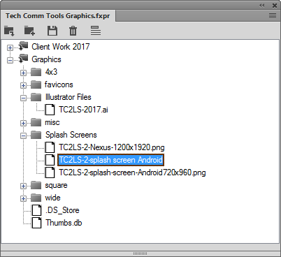
The Project Manager lets you create a book-like file that gives you easy drag and drop access graphics files and other resources that you need to add to your documents. This is a huge improvement over having to go back and forth in directories to get access to common file locations.
What I like: There’s drag and drop from Project files into your content, and the images use the new Insert Image workflow to auto-resize large images.
What I look forward to liking: I’m told that you should be able to drag and drop from the Windows File Explorer to add locations to the Project file. Unfortunately, I can’t get that to work yet on my system. I don’t see that as a huge stopper, and I imagine that this issue will resolve itself with a patch sometime later this year.
What I’d like to see added: Add a preview component to the Project Manager so you can differentiate between files with similar names.
New Welcome Screen
One very welcome improvement is the overhaul of the “splash screen” upon FrameMaker startup. While previous versions allowed access to recent files and to select resources, this new version is more approachable. There are options for a wide array of new structured and unstructured documents (FrameMaker is now in “Structured” mode by default, something you can change in Preferences). You also have redefined links to resources, including AdobeTV, the Tech Comm Suite Partner Finder, and recorded Adobe webinars.
What I like: Quick access to useful assets, without “getting in the way” of tasks. Also, the screen itself is user-custom
Changes that would help me like it more: Some links in the lower right aren’t specific enough. In particular, the Training link goes to the Partner Finder home page (the same page as the featured Partner Finder link) rather than specifically highlighting FrameMaker training in the portal. However, I’m disappointed that the link doesn’t point directly to Adobe Certified FrameMaker trainers. (https://training.adobe.com/training/partner-finder.html#p=3&product=adobe-frame-maker&type=aci)
A laundry list of new features
I’ve formatted my personal favorites in bold:
- Support for high-resolution screens
- New welcome screen
- Enhanced Table, Paragraph, and Character Designers
- Improved Conditional Tags pod
- Enhanced image insertion workflow
- Redesigned catalog pods
- Session-level scope for View menu commands
- Pods to dialog conversion
- Command shortcuts added in main menu
- New name and menu location for History and Currently Opened Files pods
- Page Break pod
- Console window change to pod
- Other user interface modernization updates
- For pods with lists, such as Conditional Tags or Cross-References pods, a tooltip displays for items listed in the pod.
- Adding or editing a variable now happens through a dialog
- List of fonts is displayed in a single column.
- All dialogs open in center of the screen.
- List of symbols is alphabetically sorted.
- List of items by which you can perform a search in the Find/Change and other dialogs are shown in alphabetical order.
- The message shown in the alert pop-up on opening an older version of file is simplified.
- The resize gripper from all pods has been removed. You can adjust the pod size by simply dragging it from any edge.
- Significant pods now show in the bottom right corner of the user interface:
- Conditional Tags
- Cross-Reference
- Markers
- Fonts
- Insets
- Variables
- References
- Hotspots
- Open Files
- Review Comments
- New project manager
- Structured authoring enhancements
- Attributes pod improvements
- Status bar shows path
- Show/Hide Snippets in Structure View.
- Changes in the Insert Cross-References pod interface
- DITA Keyspace Manager improvements
- Element menu enhancements
- Authoring enhancements
- Mini TOC auto-update
- Improved auto-spell checker
- New command search and execute tool
- Farsi to Numeric command in Direction Toolbar
- RTL markers moved to Insert menu
- Publishing enhancements
- Search autocomplete
- Text search within SVG images in responsive HTML5 output
- Support for DITA attributes in dynamic content filters
- Dynamic Content Filters support for indexes
- Manage styles from a single CSS file
- Improved image and multimedia files management
- Better handling of inline styles
- Publish all topic into a single folder
- New basic HTML output generation support
- Table of contents and index improvements
- Context-sensitive help support in DITA 1.3
Need training, or just a little help?
Tech Comm Tools has your FrameMaker training needs covered.
Get information on my premiere six-week online courses or ramp up quickly with the live classes I’ve used to train over 1,000 students to confidently use FrameMaker.
If you just need a quick answer or solution, use mattrsullivan.youcanbook.me to book time for troubleshooting, template, and digital publishing.
This is the fastest way to get answers to your toughest FrameMaker questions. Satisfaction guaranteed!
Check out the new feature videos
Tech Comm Tools has produced a ten video series showing some of the best new features of FrameMaker (2017 Release).

Join over 4,300 of your peers and get my latest content sent to you for free, along with some of my all-time favorites.


