FrameMaker 2017: Conditional text improvements
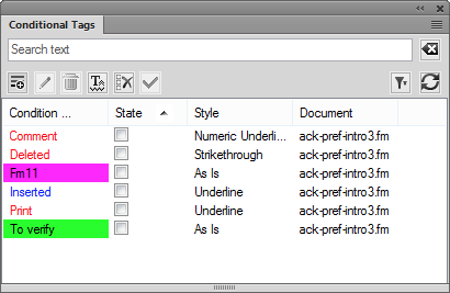
Conditional text is one of the more useful content reuse features in FrameMaker. And while the feature got a significant overhaul in the last few versions, it also got a nice bump in usability for FrameMaker 2017.

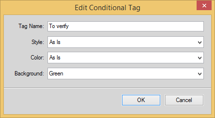
What used to be a confusing series of related pods have now been turned into dialog boxes, showing up in the center of the screen, and disappearing after changes have been made.
Here’s a video I produced, showing the new functionality:
Need a quick FrameMaker fix?
Visit mattrsullivan.youcanbook.me
Need the best FrameMaker training available?
See my Upcoming Courses page for FrameMaker and other courses.

Join over 4,300 of your peers and get my latest content sent to you for free, along with some of my all-time favorites.
