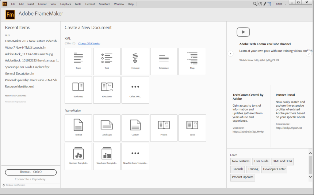
Editing FrameMaker 2017 Icons and the new Welcome screen
Last week I posted my review of the 2017 release of FrameMaker including my (generally positive) opinion of the new stuff. I asked my email list for opinions, good, bad, or otherwise and was pleasantly surprised to get back an in-depth review from Sue Thomson. Her experience was decidedly less enjoyable than mine; I asked (and received) permission to use her email as the basis for a series of posts, starting with this one. My thanks go out to Sue for taking the time to write this all down. I’ve put my responses to her experiences in italic.
(From Sue T.)
Hi Matt, funny you should ask (about FrameMaker 2017)! I’ve had some issues with it.
My immediate reaction was that I’d lost an awful lot of real estate due to the size of the toolbars and icons. They no longer fit unless I change my screen display (Control Panel\All Control Panel Items\Display) – which affects more than just FrameMaker. Not at all happy about that. It’s a retrograde step – FM2015 allowed you to choose the size, rather than imposing it.
I’m also struggling with the loss of the coloured icons – I keep getting the “squarish” ones mixed up (i.e. New Document, Open File, Save, Import File). I think I saw a reference somewhere to customising icons but I don’t remember where; maybe I can colour them.
MATT: Like you, I also appreciated the freedom of sizing icons from the preferences so that my aging eyes didn’t strain quite as much. I think it’s an interesting departure, as usually the team leaves existing code in the app, rather than pulling it out. (For example, the File > Insert > File can still be used to insert images, even though a much improved Insert > Image workflow now exists) I can see where the team wanted to align the size of the icons with your other choices in Windows, I just don’t feel that the ratios match appropriately just yet. As you pointed out in an subsequent email, you can go “under the hood” to edit icons. (perhaps snagging the old buttons?) To do this see page 70/990 in the online FrameMaker 2017 Help PDF. It’s not for the faint of heart, but it should give you the icons you want, although I don’t know what the final size of the icons may be.
Here’s a video I created that discusses setting the size of FrameMaker 2017 icons and interface items.
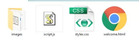
 The new Welcome screen is also customizable, via files in your user directory. I believe the files to customize are at
C:\Program Files (x86)\Adobe\Adobe FrameMaker 2017\fminit\dws\resources\welcomeScreen.
Look for another series of posts related to tightening up things with this latest version of FrameMaker.
Check out my FrameMaker training courses

Join over 9,300 of your peers and get my latest content sent to you for free, along with some of my all-time favorites.