FrameMaker 2015 First Look
June 2, 2015: Today Adobe publicly announced FrameMaker 2015, part of the Adobe Technical Suite (2015 release). And for me this version is a big deal. Big enough to get me moving on an update to my FrameMaker reference book (shipping later this month) and big enough to merit a FrameMaker Electronic Publishing online course (also debuting in June 2015).
For me, when software gets updated, I want to see what’s new and what’s fixed. So I’ve created a no-frills list of what’s going on in FrameMaker 2015. The list is in order of importance to me, along with detail of the top few items for both new and improved features. I hope you like it, and please let me know what you think of the new versions!
You can also read more on these new features in the FrameMaker 2015 Getting Started Guide, available at
http://help.adobe.com/en_US/framemaker/2015/getting-started/Fm_2015_getting_started_guide.pdf
Sign up for my newsletter to get more in depth info on these features, and updates on the book and my online courses.
New stuff
- Output mobile apps via integration with PhoneGap:Build
- Dynamic user controlled content (DUCC) filtering
- RTL support (Right to Left Languages like Hebrew and Arabic)
- Mini TOC
- Simplified XML authoring (think WordPress for structured docs)
- In-App messaging
Improved stuff
- MS Word import (at the top, because with the reworked functionality, this really could be listed under New)
- Responsive HTML5 enhancements (TOC visibility)
- Better smart filters (type ahead) in pods, better pod resizing, highlighting of active pod
- Conditional tag visibility options, conditional tag capability (books, tables)
- Enhanced DITA support
- MathML enhancements
- Support for image scale attribute in DITA
- Better tag highlighting in catalogs
- EDD update enhancements
- Structure View enhancements
- CMS Connector enhancements (SharePoint, Adobe Experience Manager)
- Packaging (archiving) enhancements
Tops on my list: Produce mobile apps from your content
So why do I like this feature so much? Because when I can convince my users to carry my content with them, I’ve won! In the era of content marketing, social selling, and email lists, nothing is more important than being the authoritative source for something. While I can hardly expect anyone to carry around my 600+ page FrameMaker book, I can easily make that content available as a mobile app that looks and feels just like a responsive web page.
So why not just use the web page? While online and application help are great, they rely on and run only in a browser. That means a user, mobile or otherwise has to start the browser, then navigate to the content. While that might be alright on a PC, it can be downright irksome on a mobile device. A mobile app removes that impediment to access. The app installs directly on the device, and allows one-click access to the information.
Need an example?
First, consider my Southwest Airlines phone app. I often forget it’s even on my phone, but when I’m on the go and need flight detail, it’s much easier to open the app than to navigate to southwest.com. Both give me access (as far as I can see) to the content and information I need, but the app is more concentrated and easier to access. But while the Southwest Airlines app is a good example, it’s a bit outside the scope of a tech comm project.
A more direct tech comm example
A simpler example would be one where your content is forward facing, accessible to the public. Let’s say you’re the working for your State Parks system, and you want to improve access to your content. The expense of print documentation is becoming prohibitive, so you’ve been delivering mainly PDF documentation for a few years. That’s great…if your user is sitting at home with a large monitor! But you’re the State Parks System, and that’s at odds with where you want your user to be. PDF is less than ideal on a mobile device and much of your content is meant to be used while enjoying the park. Responsive HTML5 is a great solution, but your responsive help system is buried on the state’s website, and you aren’t getting the traction you expected.
Then you decide to create an app with FrameMaker 2015. The app looks pretty much the same as your rockin’ website, but with a hitch…users that access your content are actually saving it to their phones so they can get to it quickly. And once the content loads, it’s on their phone, even without a network connection.
How do we get the app installed?
There are multiple ways to deploy apps for installation. Perhaps the easiest to visualize for non-developer-types is the process of uploading apps to the iOS app store and to Google Play for distribution to a broad audience.
Another way to deploy your app is to provide a direct link to the installer. You can do this by providing your user with a hypertext link, or with a QR code containing that hypertext link. Both are generated automatically during the app build process. FrameMaker 2015 has a built-in connection to Adobe PhoneGap:Build, which processes the app for different devices, stores the installer, and generates the QR code and links you need for installation. Both QR codes and links can be sent via email and newsletters, and QR codes can be placed in other places like point of sale and printed documentation. Consider how effective a QR code could be at strategic locations around the park, like the front gate and concession stands. QR codes can be like little 24/7/365 ads that give the user the ability to upload and access your content as easy as snapping a picture with their phone.
PhoneGap:Build costs
- free for your first FrameMaker-generated application
- free for Adobe Creative Cloud customers (first 25 applications)
- requires a nominal monthly fee (currently USD9.99/month for first 25 applications) if you don’t have a CC subscription
Do apps replace my other forms of delivery?
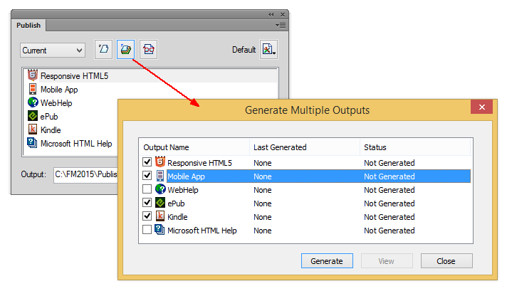
Nope, it just targets a specific market niche. A niche that just surpassed desktop computers in annual sales (sale of PCs vs. sales of smartphones) last year. You still have your print, PDF, and online help output which you can deliver to each of your other target audiences. And while you still need to use the File > Save as PDF option to produce PDF, the other electronic output can be batch produced and delivered from the FrameMaker Publish pod.
Alright, need another example? How about your company’s Policies and Procedures manual. Instead of the expense of producing print, and the headaches associated with updates and versions, create desktop and mobile versions that access current content. Just make your edits, reprocess the content, and see all that content immediately available on desktop and mobile. No update notices, no effort from users needed.
Dynamic Content Filtering
AKA Dynamic User Centric Content
In FrameMaker 2015, one of the niftier surprises for responsive output and mobile apps is the inclusion of user-centric dynamic content filtering. Think of it as role-based output on steroids. In the TCS5 releases, role-based output let you establish collections of condition text settings and assign them to a role. Your WebHelp output could then allow the user to choose among available roles. Dynamic content filtering goes beyond that, simplifying setup for the author, and allowing greater personalization for the end user.
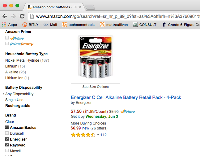
Have you ever filtered shopping results on Amazon, using criteria provided by the site? That’s DUCC at work. In our State Park example, you could have any number of conditional tags for food, camping, hiking, and the like. By filtering unneeded content from the topics, a user might more easily identify the perfect campsite or daily activity for them.
Right to Left support

While there are many places where you can specify text direction, for mixed documents, two of the most obvious places are the Paragraph Designer, and the Table Designer.
Mini TOC
Now you can insert a generated chapter level TOC in in your docs, without tedious cross-reference or text inset strategies. While this may not be as much of a game changer as the previous items, the mechanism is familiar, so you just might find yourself adding these into your longer chapter-based projects. If you’re already using chapter TOCs, you’ll certainly appreciate the ease with which this new feature works.
Word import
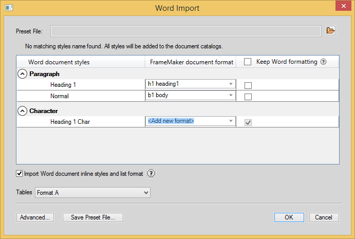
Finally! Something for FrameMaker that does more than just slurp in MS Word content! Adobe listened to the rantings of FrameMaker users, especially those of us that also use RoboHelp! FrameMaker’s new Word import feature automaps styles with the same name, and provides direct mapping of Word styles to FrameMaker styles. It’s sophisticated enough to cut your Word conversion time at least in half, presuming your Word content uses styles. If not, well, you already knew you were on your own.
Sidenote
If you have ad hoc (inline) formatting in your conversion project, try defining named FrameMaker styles that use that formatting. Then use FrameMaker’s Create and Apply Formats command to gain control of large swaths of (consistent) Word content.
Odds and Ends
There are certainly cool things elsewhere on this list, but they just don’t apply as directly to what I’ve been doing lately. I very much appreciate the existing bugs that have been fixed (you’ll never hear about most of them, they just stop things from going haywire) and also love the better functionality of the smart filters when using type-ahead in a drop-down list.
Overall I’m really happy with this latest version of FrameMaker. While I’d love to see the new interface they’ve given to RoboHelp 2015, the subtle changes they’ve made in FrameMaker 2015 are appreciated. They’re making good headway on stuff that’s been squirreled up for many (many) versions, and doing so while addressing the rapidly changing needs of tech comm.

Join over 4,300 of your peers and get my latest content sent to you for free, along with some of my all-time favorites.


[…] You will want to closely read this “deep dive” review of FrameMaker 2015. Many screen captures and thoughtful insights. Link = http://www.techcommtools.com/framemaker-2015-first-look/ […]